Chapter 1 Data Visualization with ggplot2
Learning Objectives
- Bind a data frame to a plot
- Select variables to be plotted and variables to define the presentation such as size, shape, color, transparency, etc. by defining aesthetics (
aes)- Add a graphical representation of the data in the plot (points, lines, bars) adding “geoms” layers
- Produce univariate plots, barplots and histograms, area plots, boxplots, and line plots, using ggplot.
- Produce bivariate plots, like scatter plots, hex plots, stacked bars, and bivariate line charts using ggplot.
- Modify the aesthetics for the entire plot as well as for individual “geoms” layers
- Modify plot elements (labels, text, scale, orientation)
- Group observations by a factor variable
- Break up plot into multiple panels (facetting)
- Apply ggplot themes and create and apply customized themes
- Save a plot created by ggplot as an image
1.1 What is ggplot2
There are three main plotting systems in R, the base plotting system, the lattice package, and the ggplot2 package.
Here we will introduce the ggplot2 package, which has recently soared in popularity. ggplot allows you to create graphs for univariate and multivariate numerical and categorical data in a straightforward manner. It also allows for easy grouping and conditioning. It can generate complex plots create high quality graphics for publication.
ggplot is built on Leland Wilkinson’s The Grammar of Graphics, the idea that any plot can be expressed from the same set of components:
- a data set,
- a coordinate system,
- and a set of geoms–the visual representation of data points.
The key to understanding ggplot is thinking about a figure in layers. This idea may be familiar to you if you have used image editing programs like Photoshop, Illustrator, or Inkscape.
ggplot2 provides a programmatic interface for
specifying what variables to plot, how they are displayed, and what the general visual properties are, so we only need minimal changes if the underlying data change or if we decide to change from a bar plot to a scatterplot. This helps in creating plots quickly with minimal amounts of adjustments and tweaking.
ggplot generally likes data in the ‘long’ format: i.e., a column for every dimension, and a row for every observation. Well structured data will save you lots of time when making figures with ggplot.
1.2 Plotting with ggplot2
We start by loading the required package. Note that ggplot2 is part of the collection of the tidyverse packages.
library(ggplot2)Next we load the data into R:
stops_county <- read.csv('data/MS_stops_by_county.csv')These data are a small subset extracted from the openpolicing.stanford.edu dataset and contain traffic stops by police aggregated for each county in Missisippi. Let’s take a look at the data.
head(stops_county)
str(stops_county)
The table contains two variables which represent for each county, and for both white and black, the ratio of drivers stopped out of the total population over 18: pct_black_stopped and pct_white_stopped. In order to see if there is any ‘bias’ we can plot the two values against each other and see if they line up at a 45 degree angle.
ggplot graphics are built step by step by adding new elements (layers) using the + sign.
To build a ggplot we need to:
- bind the plot to a specific data frame using the
dataargument
ggplot(data = stops_county)- define aesthetics (
aes), by selecting the variables to be plotted and the variables to define the presentation such as plotting size, shape color, etc.
ggplot(data = stops_county, aes(x = pct_black_stopped, y = pct_white_stopped))- add “geoms” – a graphical representation of the data in the plot (points, lines, bars). To add a geom to the plot use
+operator
ggplot(data = stops_county, aes(x = pct_black_stopped, y = pct_white_stopped)) +
  geom_point()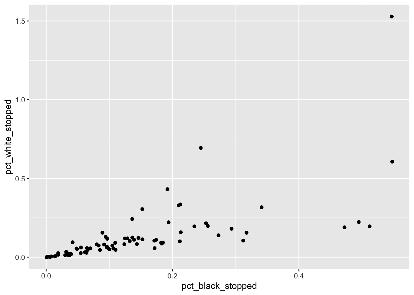
The + in the ggplot2 package is particularly useful because it allows you
to modify existing ggplot objects. This means you can easily set up plot
“templates” and conveniently explore different types of plots, so the above
plot can also be generated with code like this:
# Assign plot to a variable
MS_plot <- ggplot(data = stops_county, aes(x = pct_black_stopped, y = pct_white_stopped))

# Draw the plot
MS_plot + geom_point()
Notes:
- Any parameters you set in the
ggplot()function can be seen by any geom layers that you add (i.e., these are universal plot settings). This includes the x and y axis you set up inaes(). - Any parameters you set in a
geom_*()function are treated independently of (and possibly override) the settings defined globally in theggplot()function. - Geoms are plotted in the order they are added after each
+, that means geoms last added will display on top of prior geoms. - The
+sign used to add layers must be placed at the end of each line containing a layer. If, instead, the+sign is added in the line before the other layer,ggplot2will not add the new layer and will return an error message.
# this is the correct syntax for adding layers
MS_plot +
  geom_point()

# this will not add the new layer and will return an error message
MS_plot
  + geom_point()
To learn more about ggplot after the workshop, you may want to check out this cheatsheet about ggplot.
1.3 Building your plots iteratively
Building plots with ggplot can be of great help when you engage in exploratory data analysis. It is typically an iterative process, where you go back and forth between your data and their graphical representation, which helps you in the process of getting to know your data better.
We can start modifying this plot to extract more information from it. For instance, we can add transparency (alpha) to avoid overplotting:
MS_plot +
geom_point(alpha = 0.3)![]()
We can also add a color for all the points:
MS_plot +
  geom_point(alpha = 0.3, color= "blue")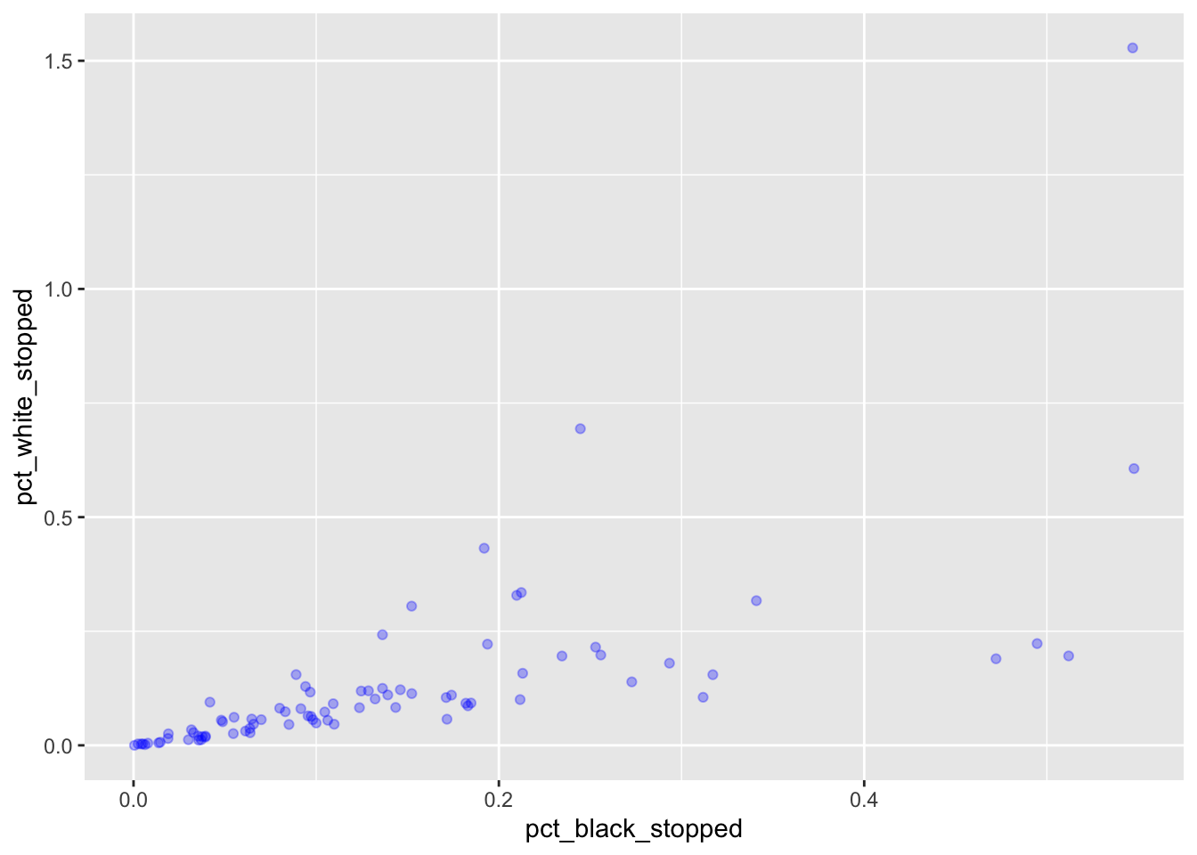
We can add another layer to the plot with +:
MS_plot +
  geom_point(alpha = 0.3, color= "blue") +
  geom_abline(intercept = 0)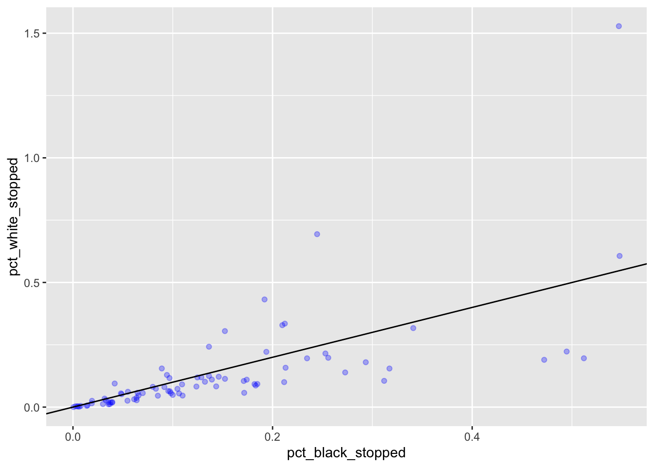
If we wanted to “zoom” into the plot, we could filter to a smaller range of values before passing them to ggplot, but we can also tell ggplot to only plot the x and y values for certain ranges. For this we use scale_x_continuous and scale_y_continuous. You will receive a message from ggplot telling you how many rows it has removed from the plot.
MS_plot +
  geom_point(alpha = 0.3, color= "blue") +
  geom_abline(intercept = 0) +
  scale_x_continuous(limits = c(0, 0.1)) +
  scale_y_continuous(limits = c(0, 0.1))
#> Warning: Removed 44 rows containing missing values (geom_point).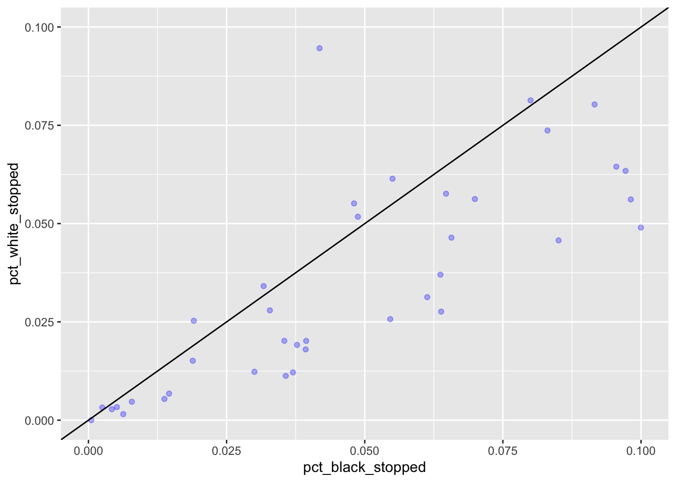
Challenge
Modify the plot above to display different color for both points and abline, and show a different range of data. How might you change the size of the dots?
Let us now use the wb_delta variable (where I have subtracted pct_black_stopped from pct_white_stopped) to indicate bias for each of the MS counties. We can use a geom called geom_col, where heights of the bars represent values in the data, like so:
ggplot(stops_county, aes(x = county_name, y = wb_delta)) +
  geom_col()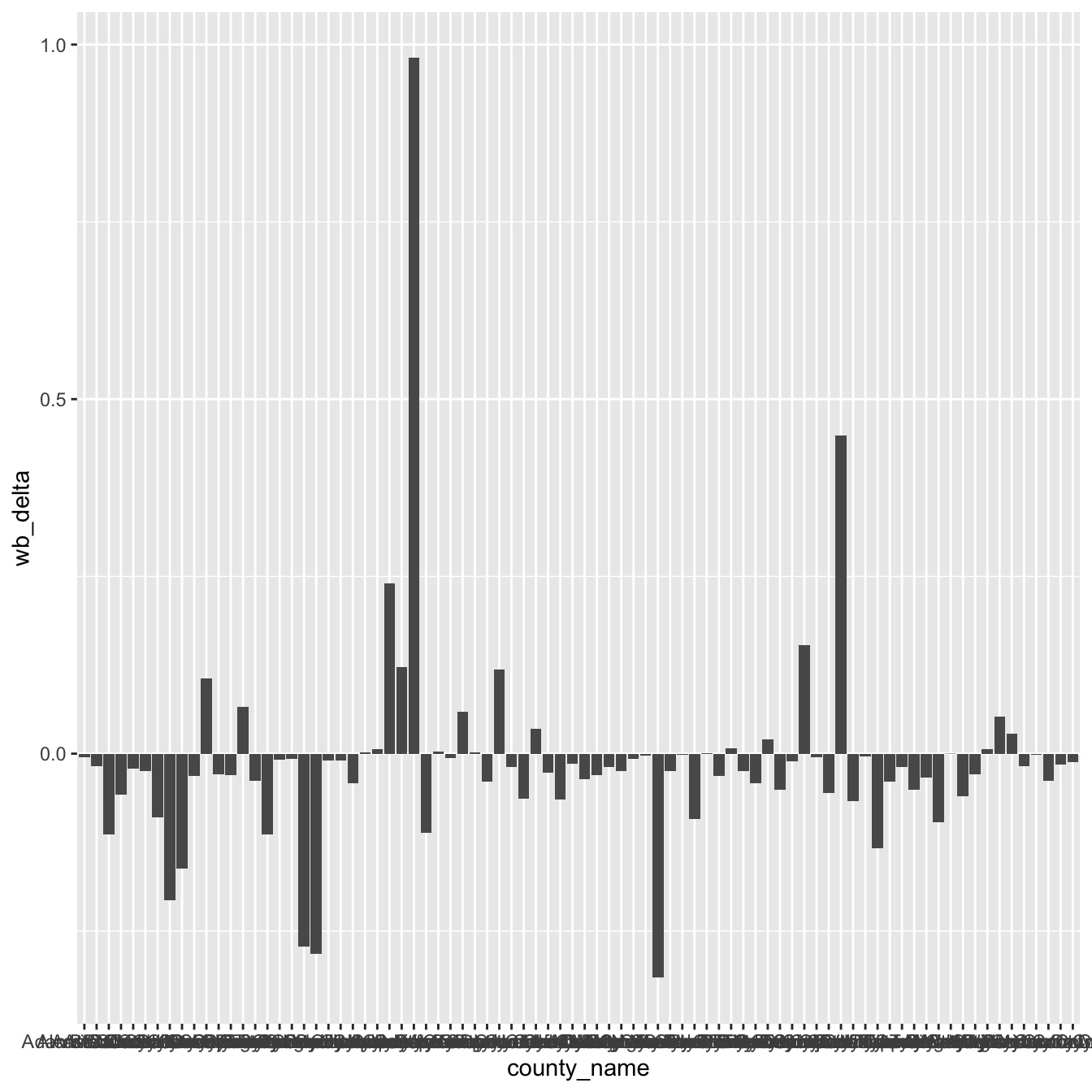
This is not very readable, so we will make some changes.
- We use coord_flip() to switch the x and y axes and be able to read the county names better:
ggplot(stops_county, aes(x = county_name, y = wb_delta)) +
  geom_col() +
  coord_flip()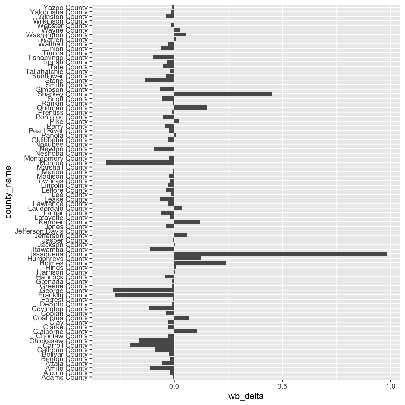
- We order the counties (x axis) by the delta values plotted on the y axis. From lowest (=black bias) to highest value (=white bias).
ggplot(stops_county, aes(x = reorder(county_name, -wb_delta), y = wb_delta)) +
  geom_col() +
  coord_flip()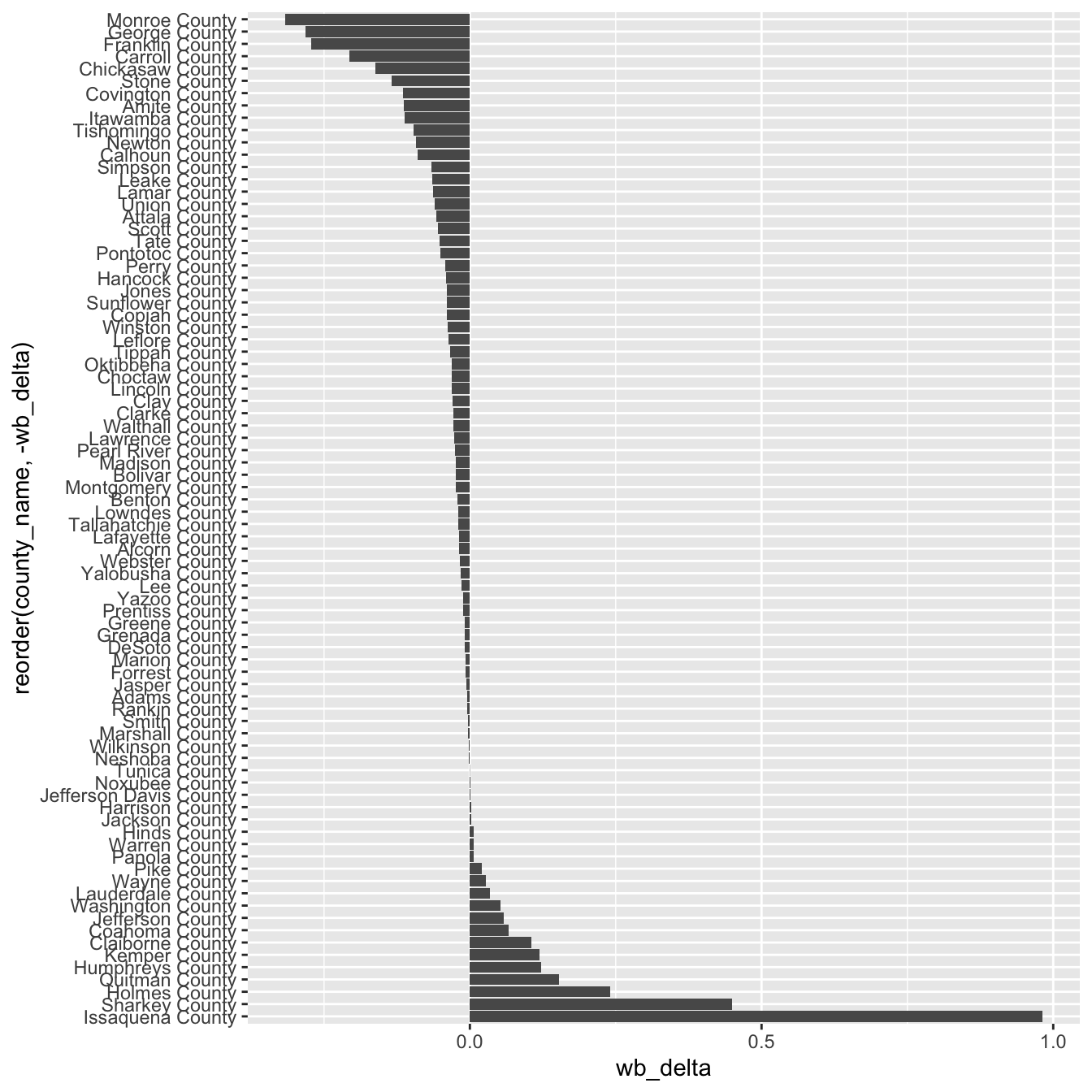
We can still improve this, but will leave it for now.
1.4 Univariate distributions
For this section we will use the other dataset provided.
stops <- read.csv('data/MS_stops.csv')It contains one entry for each traffic stop in Mississippi between 2013 and 2016.
str(stops)For distributions of discrete variables we use geom_bar. It makes the height of the bar proportional to the number of cases in each group and counts the number of cases at each x position.
If we wanted to see how many traffic violations we have of each type could say:
ggplot(stops, aes(violation)) +
  geom_bar()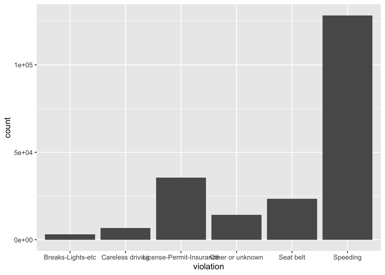
We could color the bars, but instead of color we use fill. (What happens when you use color?)
ggplot(stops, aes(violation)) +
  geom_bar(fill = "green")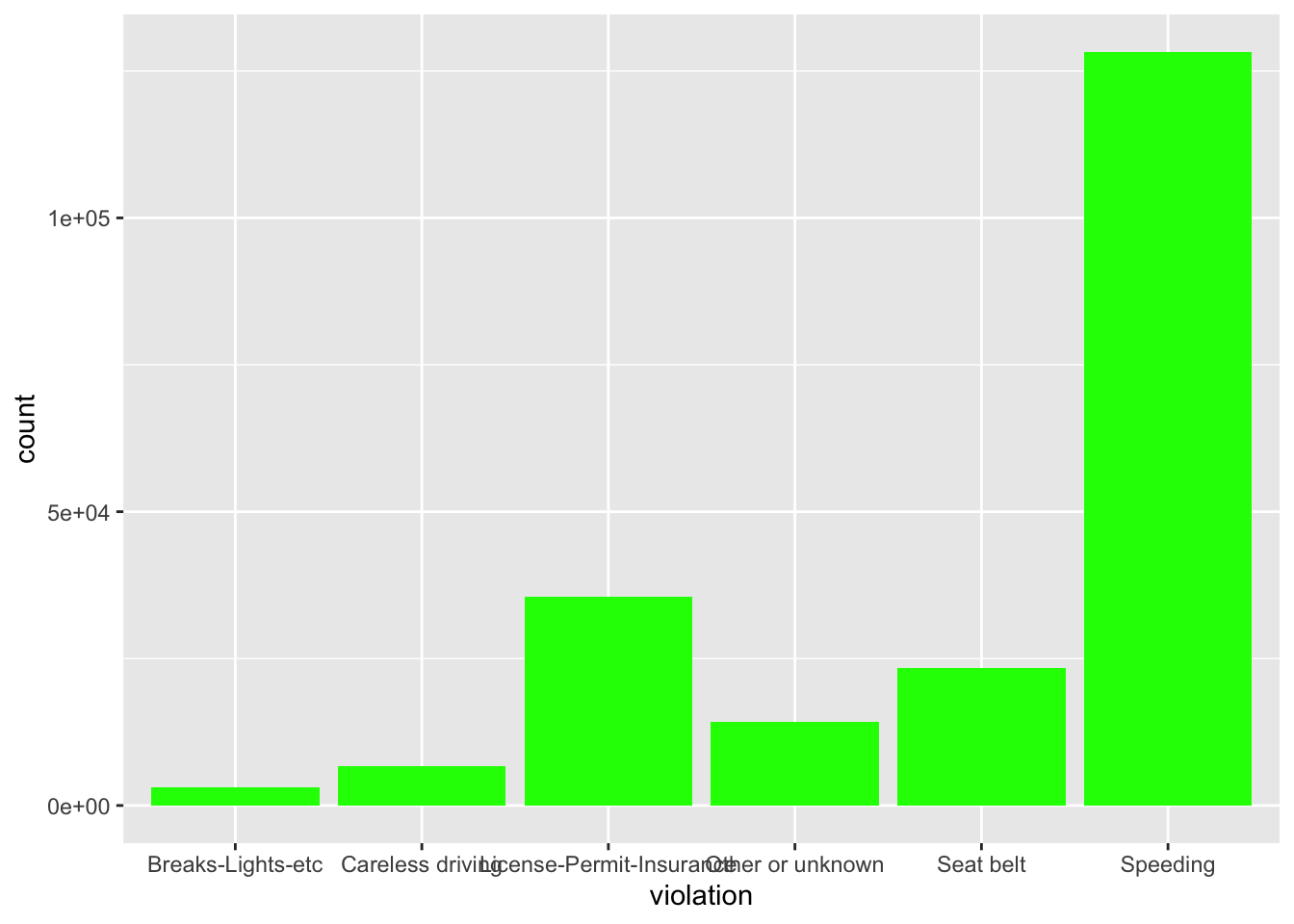
Instead of coloring everything the same we could also color by another category, say gender. For this we have to set the parameter within the aes() function, which takes care of mapping the values to different colors:
ggplot(stops, aes(violation)) +
  geom_bar(aes(fill = driver_gender))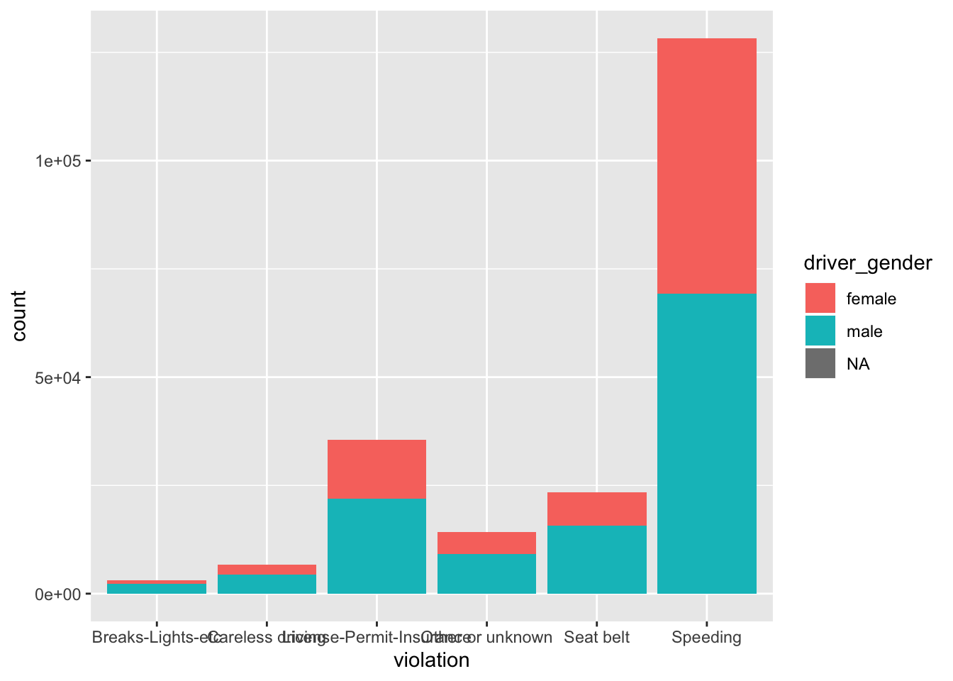
If we wanted to see the proportions within each category we can tell ggplot to stretch the bars between 0 and 1, we can set the position parameter to ‘fill’:
ggplot(stops, aes(violation)) +
  geom_bar(aes(fill = driver_gender), position = "fill")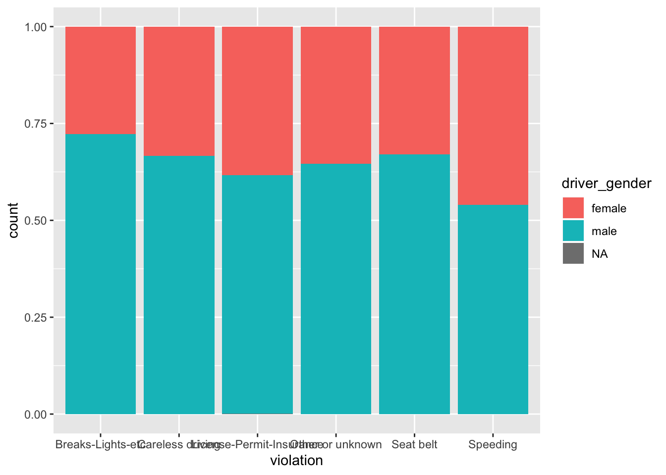
Challenge
Make a barplot that shows for each race the proportion of stops for male and female drivers. How could you get rid of the NAs?
To map a numerical continuous variable we use geom_histogram.
Challenge
Plot a histogram that shows the distribution of drivers age. Bonus: Add a vertical line for the mean age of the driver. Hint: there is a geom for this!
1.5 Boxplot
For this segment let’s extract and work with the stops for Chickasaw County only.
library(dplyr)
Chickasaw_stops <- filter(stops, county_name == "Chickasaw County")
We can use boxplots to visualize the distribution of driver age within each violation:
ggplot(data = Chickasaw_stops, aes(x = violation, y = driver_age)) +
    geom_boxplot()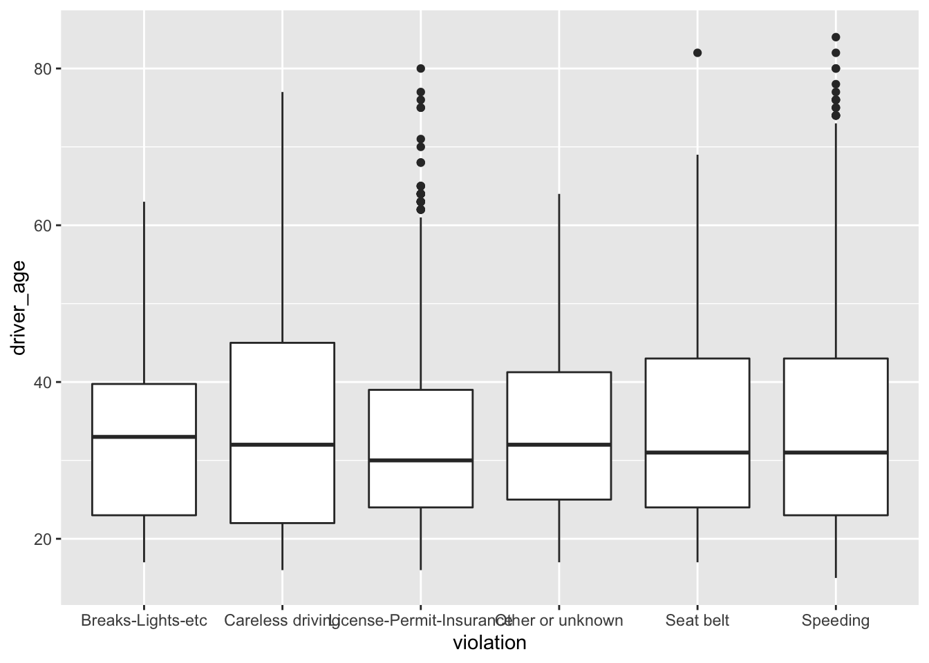
By adding points to boxplot, we can have a better idea of the number of measurements and of their distribution.
ggplot(data = Chickasaw_stops, aes(x = violation, y = driver_age)) +
    geom_boxplot() +
    geom_jitter()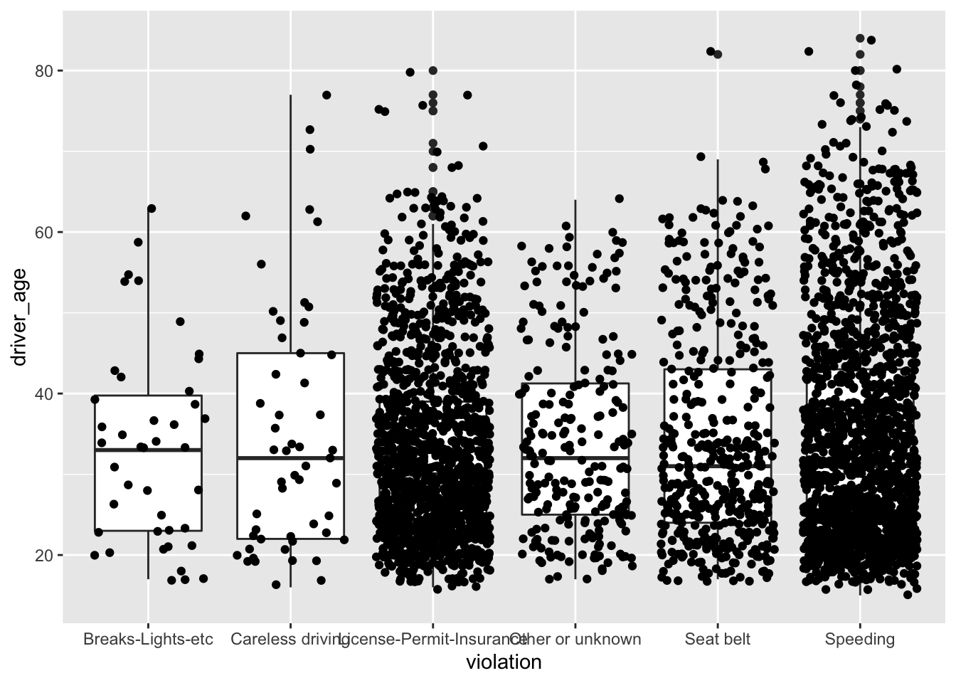
That looks quite messy. Let’s clean it up by using the alpha parameter to make the dots more transparent and also change their color:
ggplot(data = Chickasaw_stops, aes(x = violation, y = driver_age)) +
    geom_boxplot() +
geom_jitter(alpha = 0.5, color = "tomato")![]()
Notice how the boxplot layer is behind the jitter layer. We will change the plotting order to keep the boxplot visible.
ggplot(data = Chickasaw_stops, aes(x = violation, y = driver_age)) +
    geom_jitter(alpha = 0.1, color = "tomato") +
    geom_boxplot()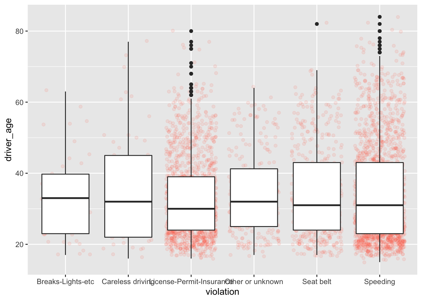
And finally we will change the transparency of the box plot so it does not cover the points:
ggplot(data = Chickasaw_stops, aes(x = violation, y = driver_age)) +
    geom_jitter(alpha = 0.1, color = "tomato") +
geom_boxplot(alpha = 0) 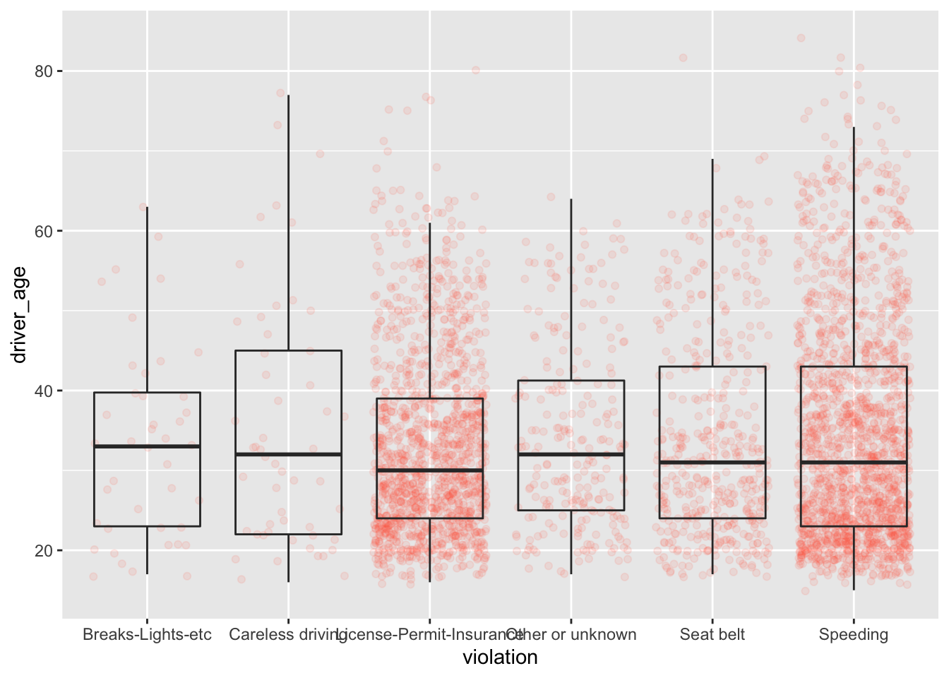
Boxplots are useful summaries, but hide the shape of the distribution. For example, if there is a bimodal distribution, it would not be observed with a boxplot. An alternative to the boxplot is the violin plot (sometimes known as a beanplot), where the shape (of the density of points) is drawn.
Challenge
Replace the box plot of the last graph with a violin plot.
So far, we’ve looked at the distribution of age within violations Create a new plot to explore the distribution of age for another categorical variable.
1.6 Plotting time series data
To demonstrate time series data we will count the number of violations for each day of the week. First we will create a table wd_violations.
wd_violations <- stops %>%
  # group by weekday and violations:
  group_by(wk_day, violation) %>%
  # count occurrences:
  tally()

head(wd_violations)
#> # A tibble: 6 x 3
#> # Groups: wk_day [1]
#> wk_day violation n
#> <fct> <fct> <int>
#> 1 Fri Breaks-Lights-etc 564
#> 2 Fri Careless driving 1150
#> 3 Fri License-Permit-Insurance 6603
#> 4 Fri Other or unknown 2603
#> 5 Fri Seat belt 3948
#> 6 Fri Speeding 20767Time series data can be visualized as a line plot (with – you guessed it! – geom_line()) mapping the days to the x axis and counts to the y axis:
ggplot(wd_violations, aes(x = wk_day, y = n)) +
  geom_line()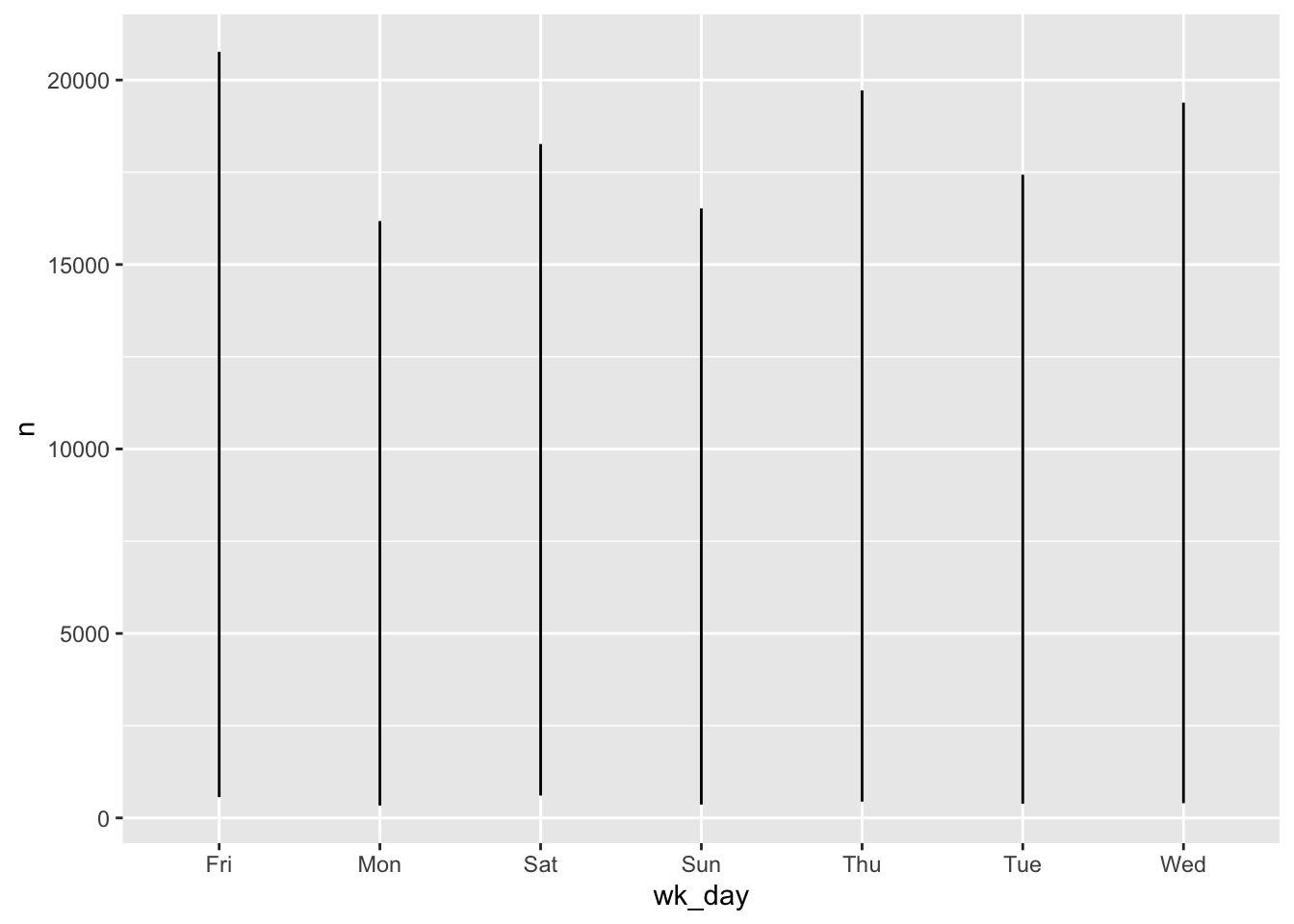
Oops.
Unfortunately, there are a couple of problems with this plot.
Firstly, because we plotted data for all the violations together, ggplot displays the range of all values for each day in a vertial line. We need to tell ggplot to draw a line for each violation. We do this by modifying the aesthetic function to include an instruction to to group by violation: group = violation.
ggplot(wd_violations, aes(x = wk_day, y = n, group = violation)) +
  geom_line()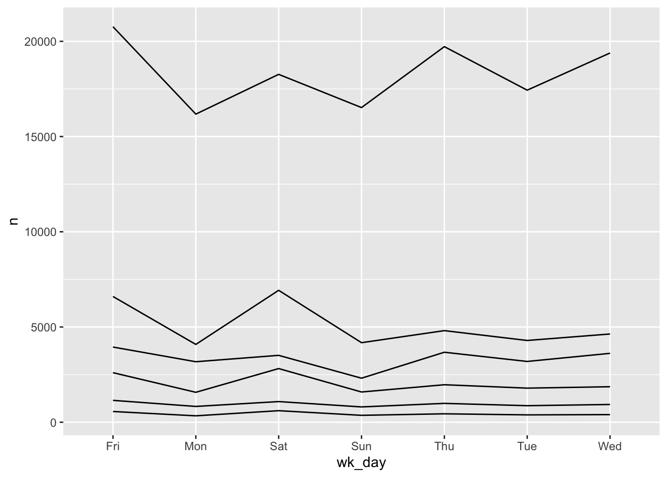
Secondly, the weekdays are out of order. When we read the table with read.csv R determined that wk_day was a factor and assigned levels in alphabetical order.
class(stops$wk_day)#> [1] "factor"levels(stops$wk_day)#> [1] "Fri" "Mon" "Sat" "Sun" "Thu" "Tue" "Wed"We can reorder the levels, recreate the summary table and plot again.
stops$wk_day <- factor(stops$wk_day,
                       levels=c("Mon", "Tue", "Wed", "Thu", "Fri", "Sat", "Sun"))

wd_violations <- stops %>%
  group_by(wk_day, violation) %>%
  tally()

ggplot(wd_violations, aes(x = wk_day, y = n, group = violation)) +
  geom_line()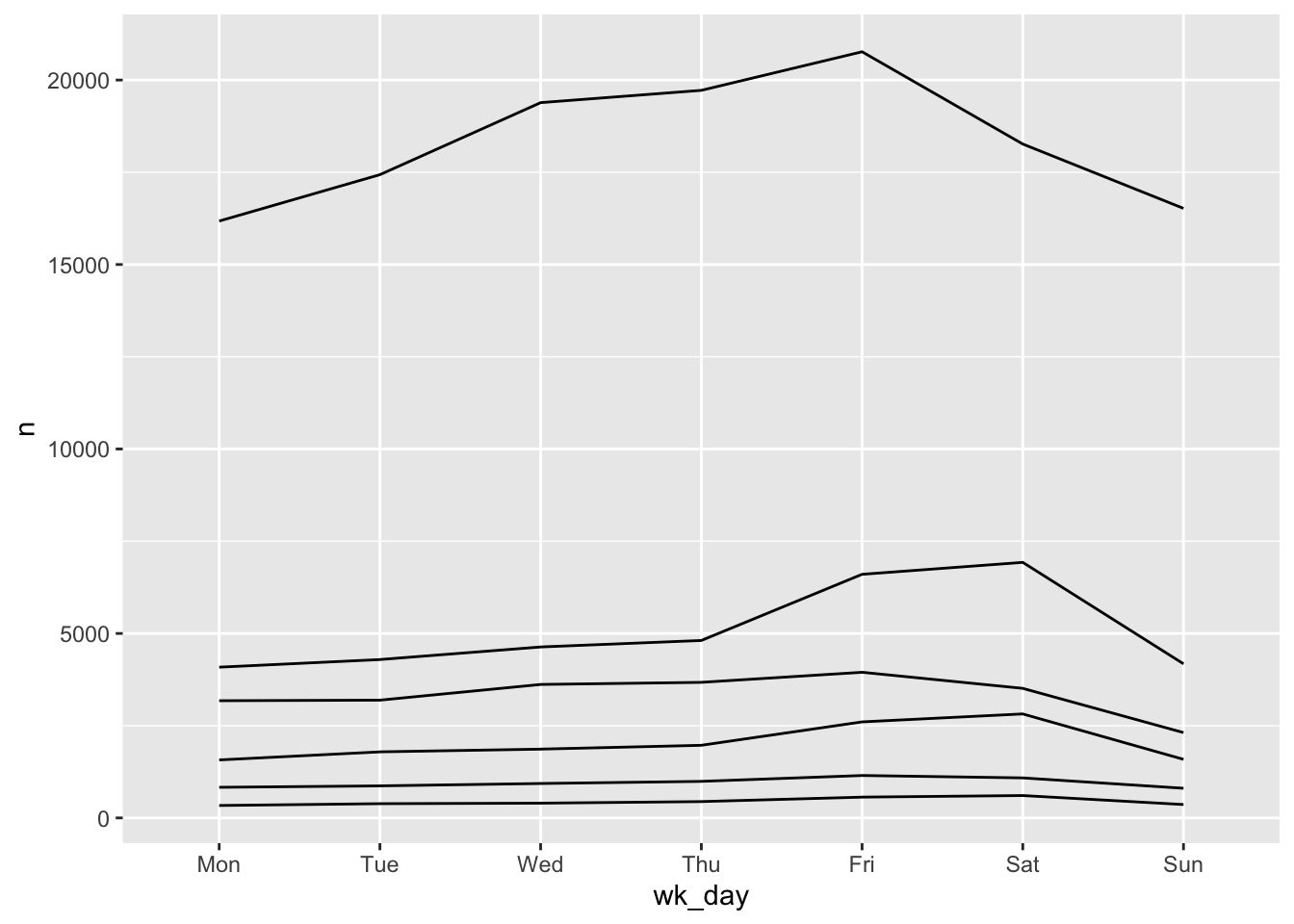
We will be able to distinguish violations in the plot if we add colors. (If the variable is numeric color groups automatically.)
ggplot(wd_violations, aes(x = wk_day, y = n, group = violation, color = violation)) +
  geom_line()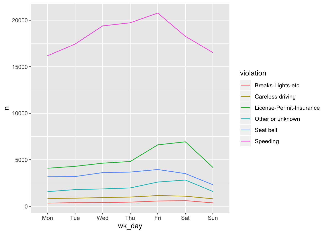
If you have a lot of data (like for example a term document matrix) you may want to plot your data as a heatmap. There is no specific heatmap plotting function in ggplot2, but combining geom_tile with a smooth gradient fill (scale_fill_gradient) does the job very well. For our weekday example it would look like this:
ggplot(wd_violations, aes(x = wk_day, y = violation)) +
     geom_tile(aes(fill=n)) +
     scale_fill_gradient(low="grey95", high = "tomato")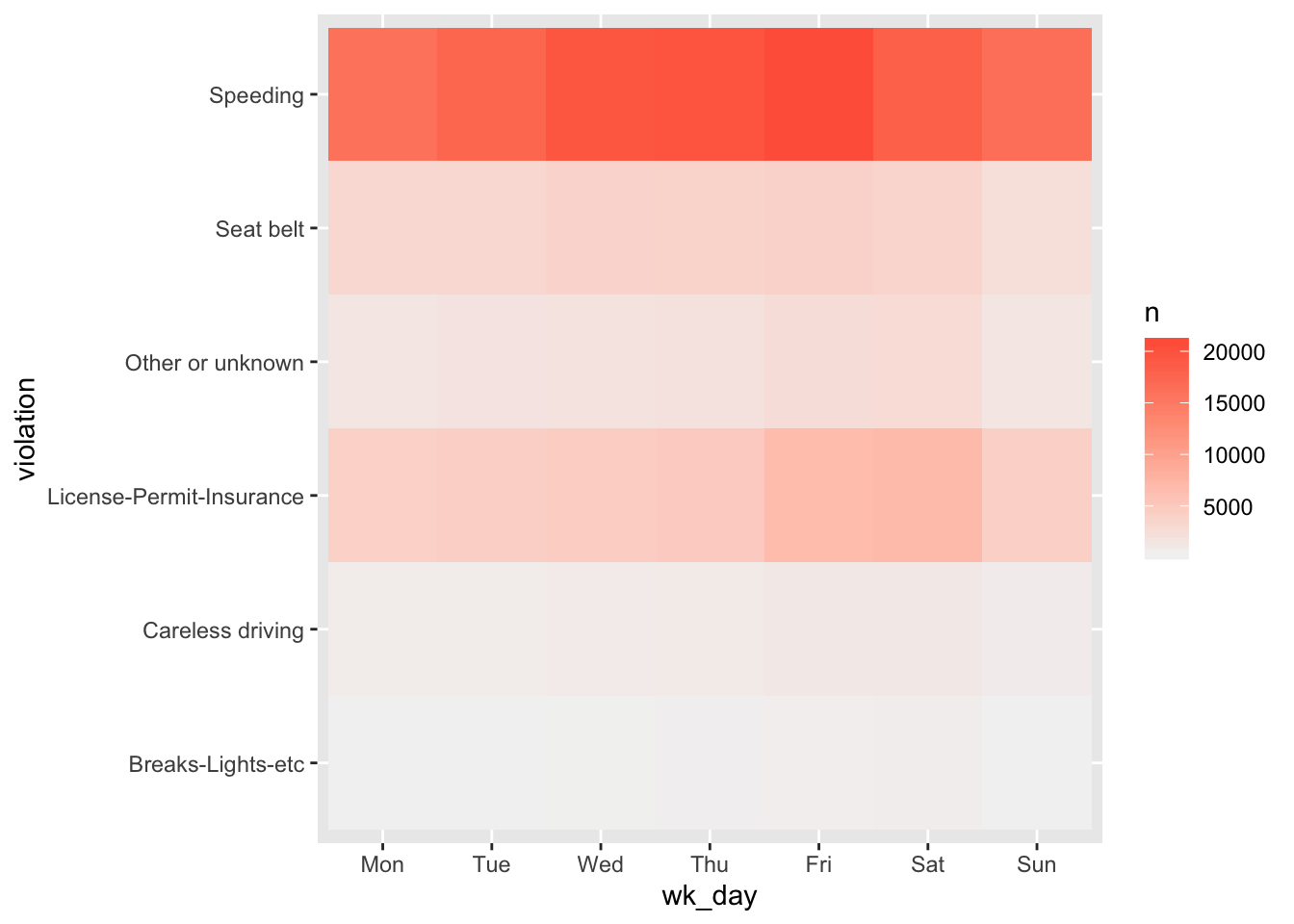
The code below show a more extensive example that maps raw violations against day of the year.
stops %>%
  group_by(y_day, violation_raw) %>%
  tally() %>%
  ggplot(aes(y_day, violation_raw)) +
     geom_tile(aes(fill=n)) +
     scale_fill_gradient(low="grey95", high = "tomato") +
     theme_minimal() # (more about this below)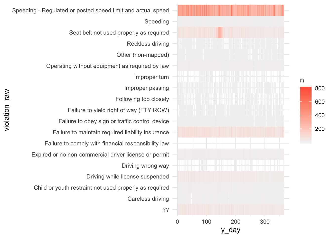
1.7 Faceting
ggplot implements a special technique called faceting that allows to split one plot into multiple plots based on a factor included in the dataset. We will use it to make a time series plot for each violation:
ggplot(wd_violations, aes(x = wk_day, y = n, group = violation)) +
     geom_line() +
     facet_wrap(~ violation)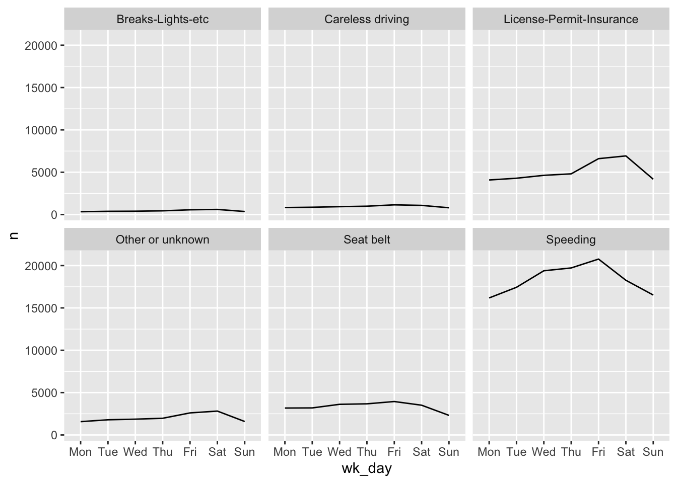
Now we would like to split the line in each plot by the race of the driver. To do that we need to create a different data frame with the counts grouped not only by wk_day and violation, but also driver_race.
wd_viol_race <- stops %>%
  group_by(wk_day, violation, driver_race) %>%
  tally()
#> Warning: Factor `driver_race` contains implicit NA, consider using
#> `forcats::fct_explicit_na`We then make the faceted plot by splitting further by race using color and group (within a single plot):
ggplot(wd_viol_race, aes(x = wk_day, y = n, color = driver_race, group = driver_race)) +
  geom_line() +
  facet_wrap(~ violation)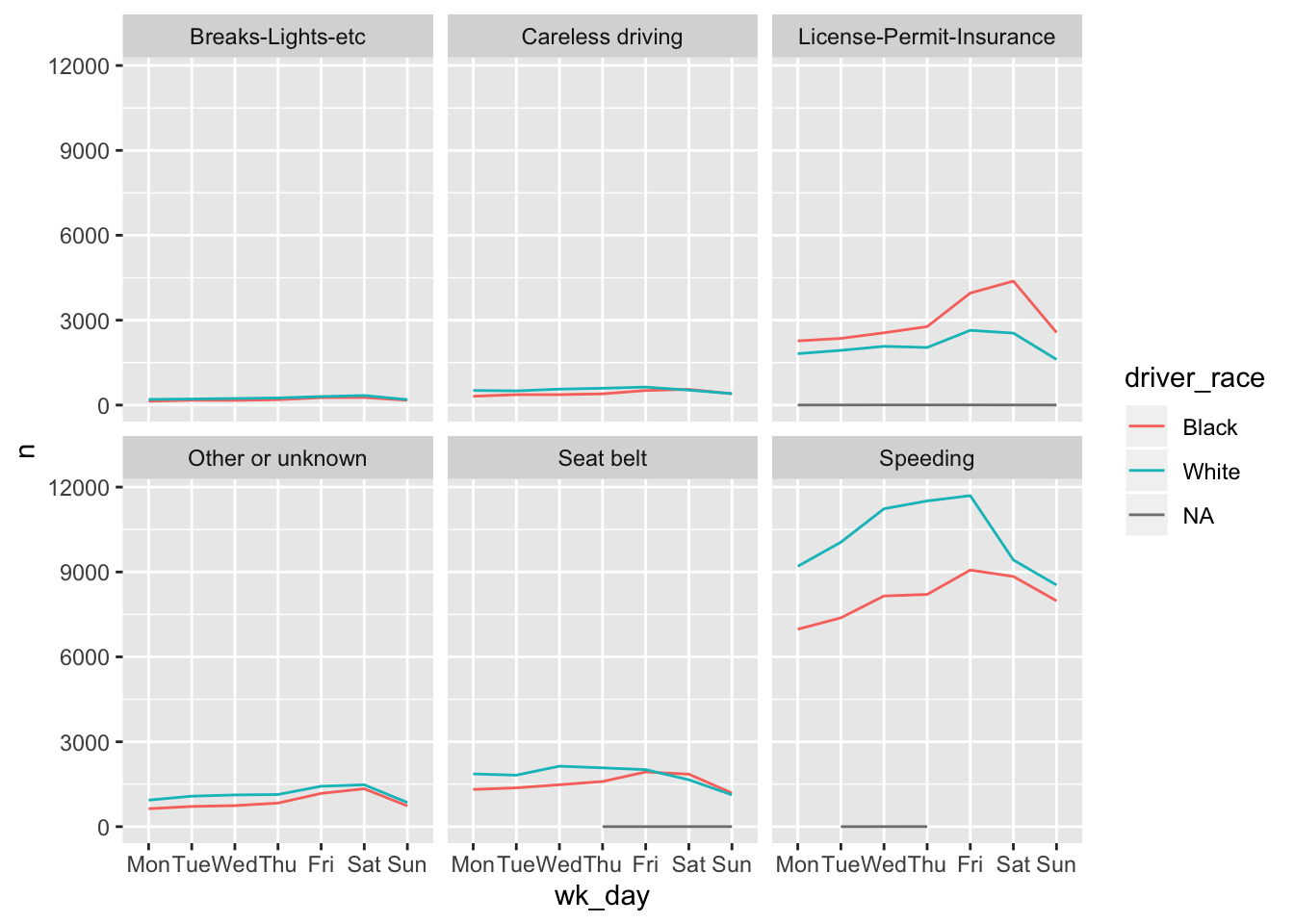
Note that there is an alternative, the facet_grid geometry, which allows you to explicitly specify how you want your plots to be
arranged via formula notation (rows ~ columns; a . can be used as
a placeholder that indicates only one row or column).
Challenge
Use what you just learned to create a plot that depicts the change of the average age of drivers through the week for each driver race. First create a data frame
wd_viol_age, grouped by weekday, race, and violation and calculate the mean age per grouop. Hint: Instead of tally usesummarize(avg_age = mean(driver_age))to calculate the mean driver age. Now split your plot so we can see one plot for each violation type. How would you go about visualizing both lines and points on the plot?
1.8 ggplot2 themes
ggplot2
comes with several other themes which can be useful to quickly change the look
of your visualization, for example theme_bw() changes the plot background to white:
ggplot(wd_viol_race, aes(x = wk_day, y = n, color = driver_race, group = driver_race)) +
  geom_line() +
  facet_wrap(~ violation) +
  theme_bw()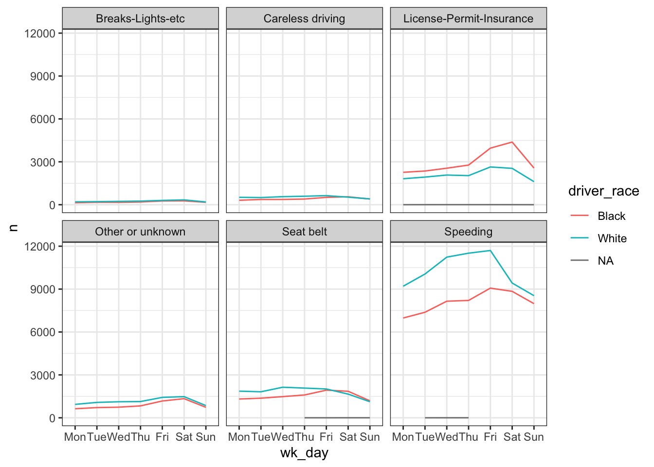
The complete list of themes is available
at http://docs.ggplot2.org/current/ggtheme.html. theme_minimal() and theme_light() are popular, and theme_void() can be useful as a starting point to create a new hand-crafted theme.
The ggthemes package
provides a wide variety of options (including an Excel 2003 theme).
The ggplot2 extensions website provides a list
of packages that extend the capabilities of ggplot2, including additional themes.
1.9 Customization
There are endless possibilities to customize details of your plot, particularly when you are ready for publication or presentation. Let’s look into just a few examples. Before we do that we will assign our plot above to a variable.
stops_facet_plot <- ggplot(wd_viol_race, aes(x = wk_day, y = n, color = driver_race, group = driver_race)) +
  geom_line() +
  facet_wrap(~ violation)
Now, let’s change names of axes to something more informative than ‘wk_day’ and ‘n’ and add a title to the figure:
stops_facet_plot +
  labs(title = 'Observed violations per day of week',
         x = 'Weekday of observation',
         y = 'Number of violations') +
  theme_bw()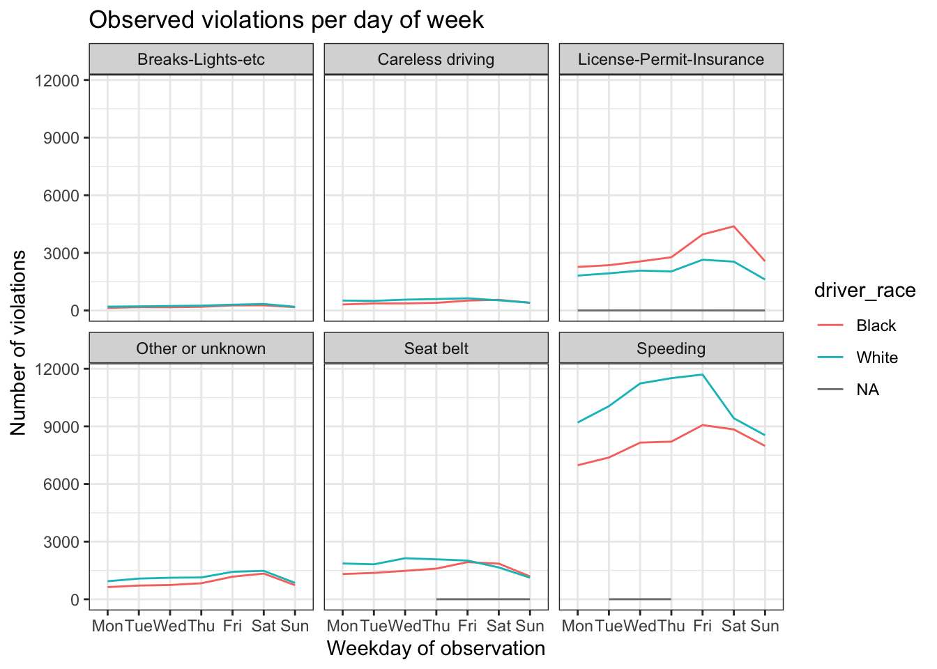
The axes have more informative names, but their readability can be improved by increasing the font size:
stops_facet_plot +
  labs(title = 'Observed violations per day of week',
         x = 'Weekday of observation',
         y = 'Number of violations') +
  theme_bw() +
  theme(text = element_text(size=16))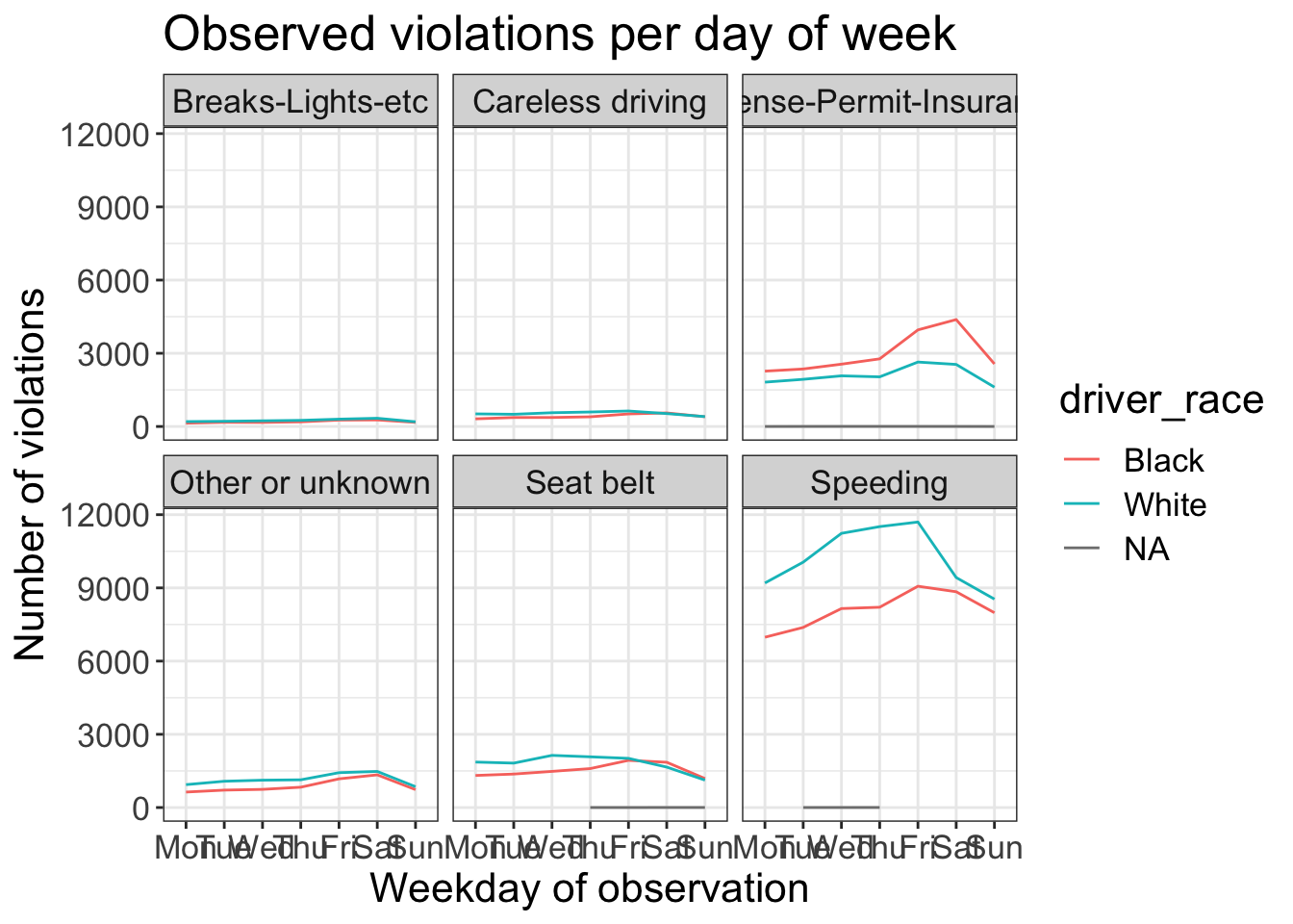
That bumps up all the text sizes, so let’s manipulate them individually.
For the x-axis we will make the text smaller and adjust the labels vertically and horizontally so they don’t overlap. You can use a 90 degree angle, or experiment to find the appropriate angle for diagonally oriented labels.
For the titles of the subplots we also reduce the size back to 12 pixels.
stops_facet_plot +
  labs(title = 'Observed violations per day of week',
         x = 'Weekday of observation',
         y = 'Number of violations') +
  theme_bw() +
  theme(axis.text.x = element_text(colour="grey40", size=12, angle=90, hjust=.5, vjust=.5),
        axis.text.y = element_text(colour="grey40", size=12),
        strip.text = element_text(size=12),
        text = element_text(size=16))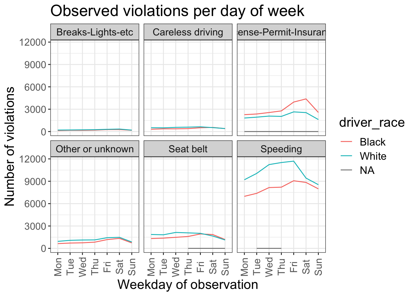
If you like the changes you created better than the default theme, you can save them as an object and apply it to other plots you may create:
my_grey_theme <- theme(axis.text.x = element_text(colour="grey40", size=12, angle=90, hjust=.5, vjust=.5),
                   axis.text.y = element_text(colour="grey40", size=12), text=element_text(size=16))

ggplot(data = Chickasaw_stops, aes(x = violation, y = driver_age)) +
  geom_boxplot() +
  my_grey_theme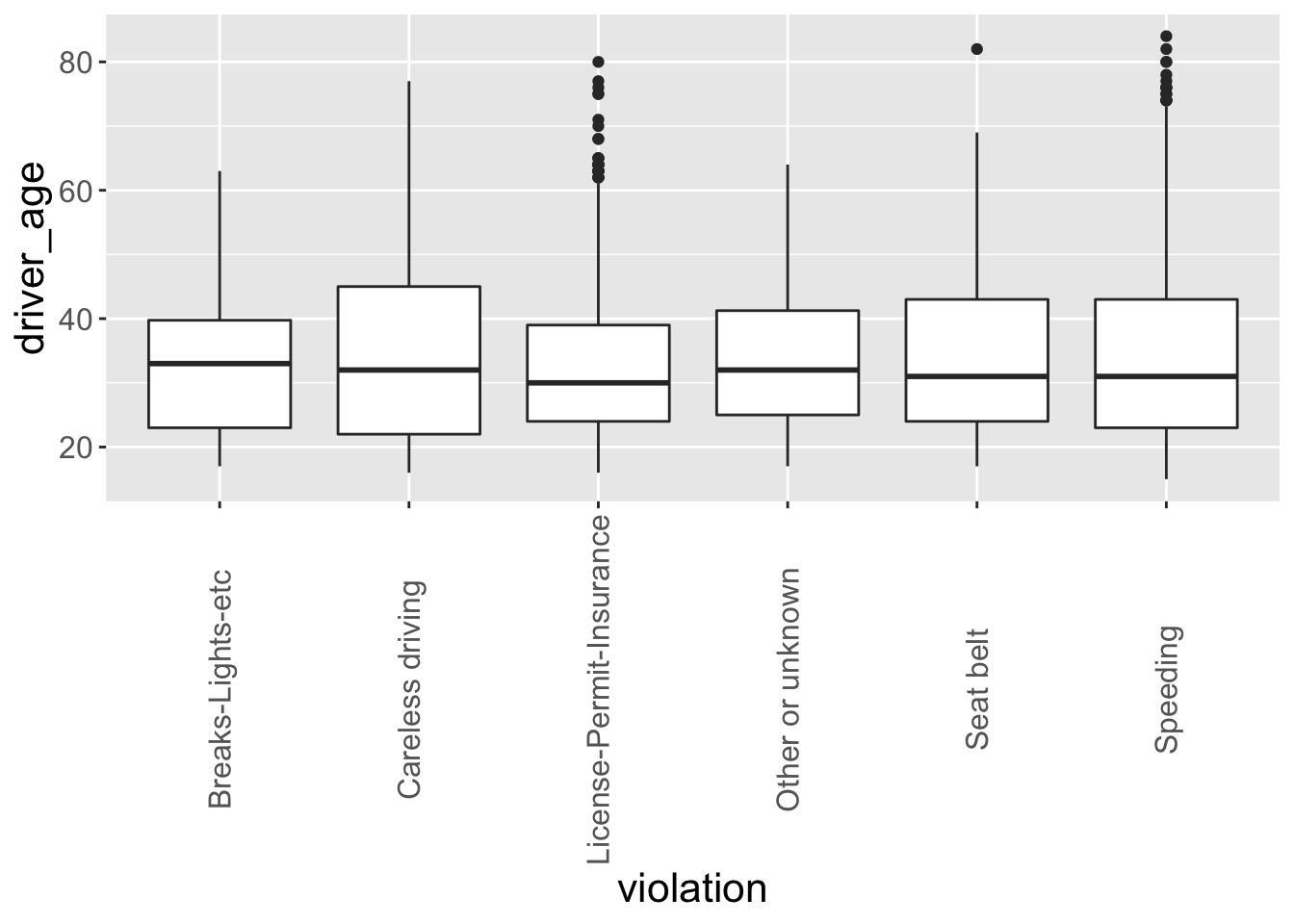
Note that it is also possible to change the fonts of your plots. If you are on Windows, you may have to install the extrafont package, and follow the instructions included in the README for this package.
After creating your plot, you can save it out to a file in your prefered format. You can change the dimension (and resolution) of your plot by adjusting the appropriate arguments (width, height and dpi):
my_plot <- stops_facet_plot +
  labs(title = 'Observed violations per day of week',
         x = 'Weekday of observation',
         y = 'Number of violations') +
  theme_bw() +
  theme(axis.text.x = element_text(colour="grey40", size=12, angle=90, hjust=.5, vjust=.5),
        axis.text.y = element_text(colour="grey40", size=12),
        strip.text = element_text(size=14),
        text = element_text(size=16))

ggsave("name_of_file.png", my_plot, width=15, height=10)
Note: The parameters width and height also determine the font size in the saved plot.
Challenge
Improve one of the plots you generated or create a beautiful graph of your own and save it to your desktop. Use the RStudio
ggplot2cheat sheet for inspiration.Here are some ideas: * See if you can change the thickness of the lines. * Can you find a way to change the name of the legend? What about its labels? * Try using a different color palette (see http://www.cookbook-r.com/Graphs/Colors_(ggplot2)/).