Chapter 3 Making Maps in R
Learning Objectives
- plot an
sfobject- create a choropleth map with
ggplot- plot a raster map with
ggplot- use
RColorBrewerto improve legend colors- use
classIntto improve legend breaks- create a choropleth map with
tmap- plot a raster map with
tmap- create an interactive map with
leaflet- customize a
leafletmap with popups and layer controls
In the preceding examples we have used the base plot command to take a quick look at our spatial objects.
In this section we will explore several alternatives to map spatial data with R. For more packages see the “Visualisation” section of the CRAN Task View.
3.1 Choropleth Mapping with ggplot2
ggplot2 is a widely used and powerful plotting library for R. It is not specifically geared towards mapping, it is possible to create quite nice maps.
For an introduction to ggplot check out this site for more pointers.
ggplot can plot sf objects directly by using the geom geom_sf. So we can take advantage of this and say:
# if you need to read this in again:
# crimes_sf <- st_read("data/PhillyCrimerate")
ggplot(crimes_sf) +
  geom_sf(aes(fill=homic_rate))
We can add more map layers to ggplot with the familiar “+” sign:
#> Reading layer `Roosevelt_blvd' from data source
#>   `/Users/cengel/Anthro/R_Class/R_Workshops/R-spatial/data/Roosevelt_blvd'
#>   using driver `ESRI Shapefile'
#> Simple feature collection with 1 feature and 1 field
#> Geometry type: LINESTRING
#> Dimension:     XY
#> Bounding box:  xmin: 1746511 ymin: 472799.6 xmax: 1760254 ymax: 487615.1
#> Projected CRS: Albers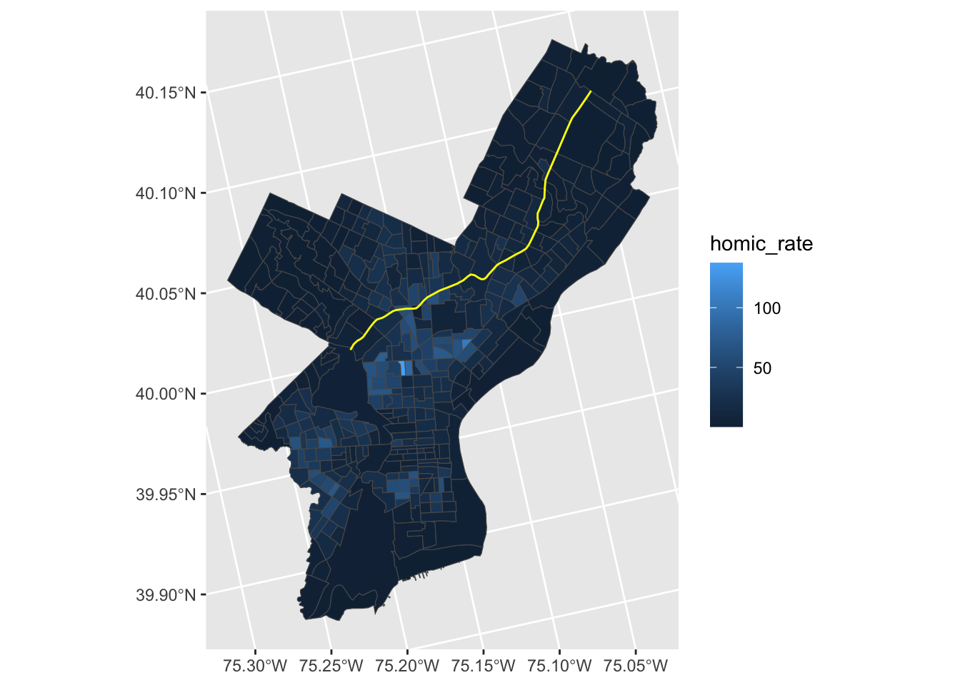
Homicide rate is a continuous variable and is indicated in legend by ggplot as such. To modify the legend to resemble more closely ‘choropleth’ map legend we need to convert our continuous variable into a categorical one, according to whichever brackets we want to use.
This requires two steps:
- Determine the quantile breaks.
- Add a categorical variable to the object which assigns each continious vaule to a bracket.
We will use the classInt package to explicitly determine the quantile breaks.
library(classInt)
# get quantile breaks. Add .00001 offset to catch the lowest value
breaks_qt <- classIntervals(c(min(crimes_sf$homic_rate) - .00001,
                              crimes_sf$homic_rate),
                            n = 7,
                            style = "quantile")

str(breaks_qt)
#> List of 2
#> $ var : num [1:385] 0.3 14.2 10.5 12.7 38.9 ...
#> $ brks: num [1:8] 0.3 1.86 4.81 8.5 16.14 ...
#> - attr(*, "style")= chr "quantile"
#> - attr(*, "nobs")= int 385
#> - attr(*, "call")= language classIntervals(var = c(min(crimes_sf$homic_rate) - 1e-05, crimes_sf$homic_rate), n = 7, style = "quantile")
#> - attr(*, "intervalClosure")= chr "left"
#> - attr(*, "class")= chr "classIntervals"Ok. We can retrieve the breaks with breaks$brks.
We use cut to divide homic_rate into intervals and code them according to which interval they are in.
Lastly, we can use scale_fill_brewer and add our color palette.
crimes_sf %>%
  mutate(homic_rate_cat = cut(homic_rate, breaks_qt$brks)) %>%
  ggplot() +
    geom_sf(aes(fill=homic_rate_cat)) +
scale_fill_brewer(palette = "OrRd") 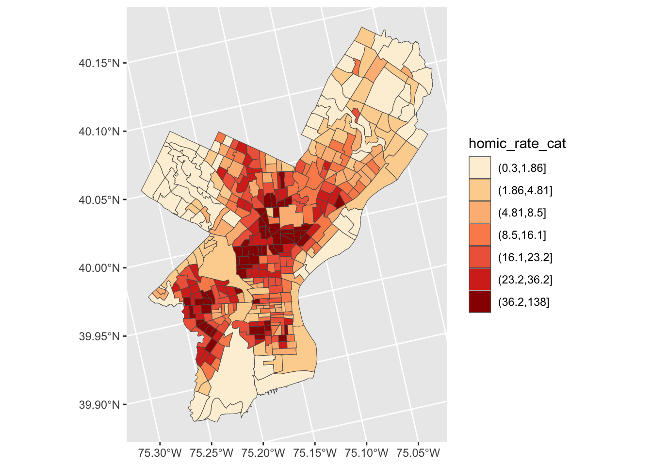
3.2 Raster and ggplot
To visualize raster data using ggplot2, we will use the raster with the values for the digital terrain model (DTM).
Before using ggplot we need to convert it to a dataframe. The terra package has an built-in function for conversion to a plot-able dataframe.
# If you need to read it in again:
# HARV_DTM <- rast("data/HARV_dtmCrop.tif")

HARV_DTM_df <- as.data.frame(HARV_DTM, xy = TRUE)
str(HARV_DTM_df)
#> 'data.frame': 2319798 obs. of 3 variables:
#> $ x : num 731454 731454 731456 731456 731458 ...
#> $ y : num 4713838 4713838 4713838 4713838 4713838 ...
#> $ HARV_dtmCrop: num 389 390 389 389 389 ...We can now use ggplot() to plot this data frame. We will set the color scale to scale_fill_viridis_c which is a color-blindness friendly color scale. Here is more about the viridis color maps. We will also use the coord_fixed() function with the default, ratio = 1, which ensures that one unit on the x-axis is the same length as one unit on the y-axis.
ggplot() +
    geom_raster(data = HARV_DTM_df , aes(x = x, y = y, fill = HARV_dtmCrop)) +
    scale_fill_viridis_c() +
    coord_fixed()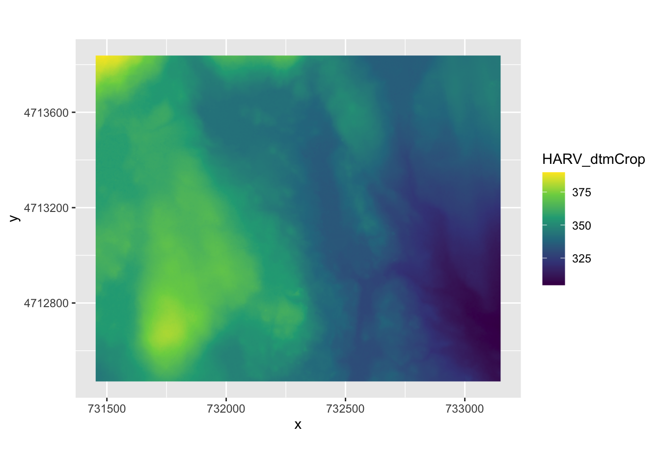
3.3 Choropleth with tmap
tmap is specifically designed to make creation of thematic maps more convenient. It borrows from the ggplot syntax and takes care of a lot of the styling and aesthetics. This reduces our amount of code significantly. We need:
tm_shape()– where we provide:- the
sfobject
- the
tm_polygons()– where we set:- the attribute variable to map,
- the break style, and
- a title.
library(tmap)

tm_shape(crimes_sf) +
  tm_polygons(fill = "homic_rate",
              fill.scale = tm_scale_intervals(style="quantile"),
              fill.legend = tm_legend(title = "Philadelphia \nhomicides \nper sqKm\n"))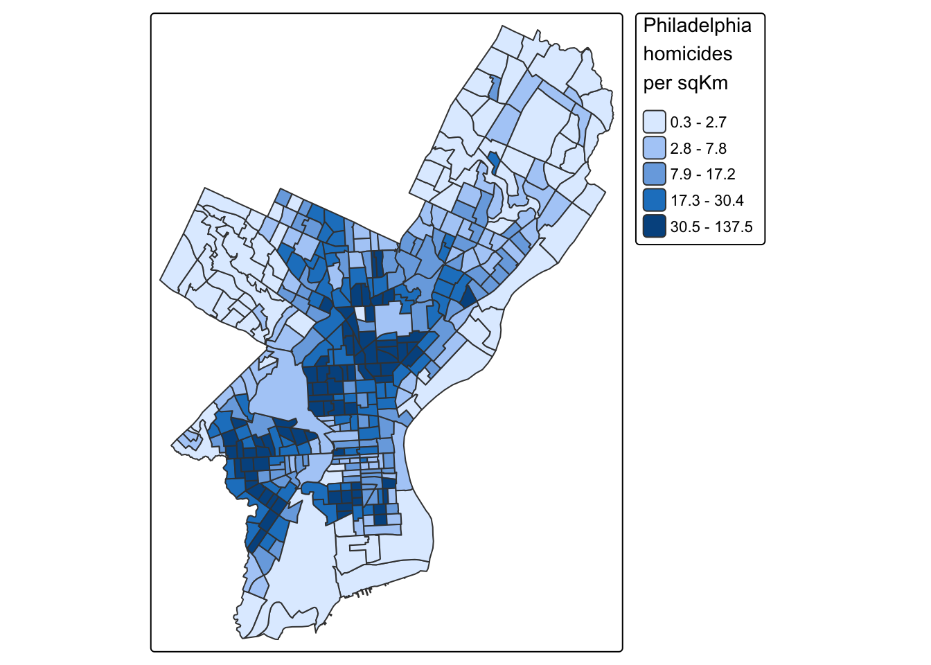
tmap has a very nice feature that allows us to give basic interactivity to the map. We can switch from “plot” mode into “view” mode and call the last plot, like so:
Cool huh?
The tmap library also includes functions for simple spatial operations, geocoding and reverse geocoding using OSM. For more check vignette("tmap-getstarted").
3.4 Raster with tmap
tmap can also plot raster files natively, for example:
#> ℹ tmap modes "plot" - "view"tm_shape(HARV_DTM)+
tm_raster(style = "cont", palette = "viridis")+
tm_layout(legend.outside = TRUE)#>
#> ── tmap v3 code detected ───────────────────────────────────────────────────────
#> [v3->v4] `tm_raster()`: instead of `style = "cont"`, use col.scale =
#> `tm_scale_continuous()`.
#> ℹ Migrate the argument(s) 'palette' (rename to 'values') to
#> 'tm_scale_continuous(<HERE>)'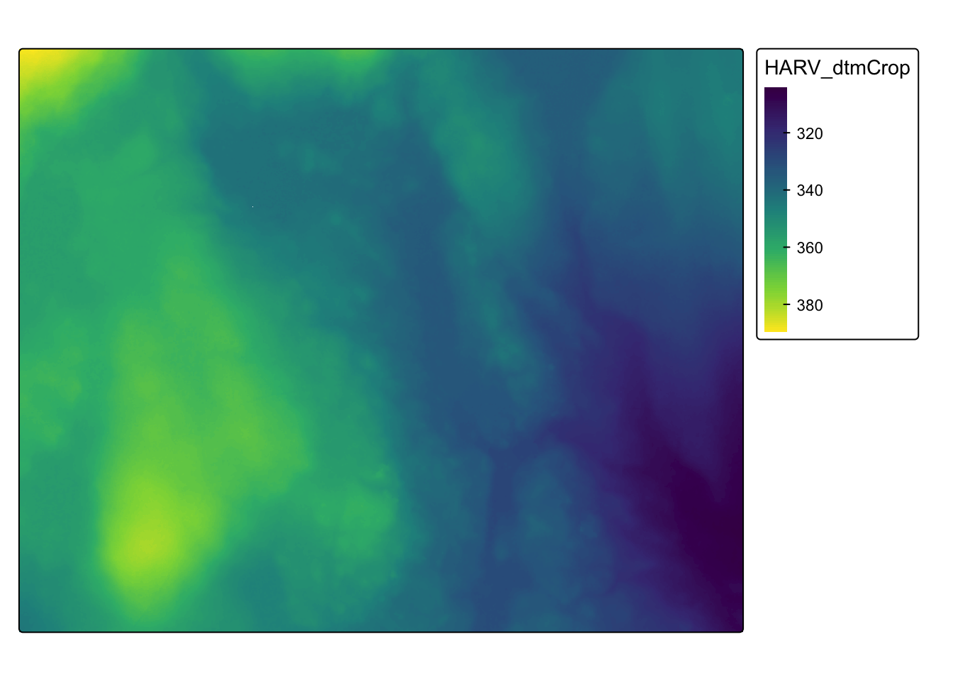
See Elegant and informative maps with tmap for more options.
3.5 Web mapping with leaflet
leaflet provides bindings to the ‘Leaflet’ JavaScript library, “the leading open-source JavaScript library for mobile-friendly interactive maps”. We have already seen a simple use of leaflet in the tmap example.
The good news is that the leaflet library gives us loads of options to customize the web look and feel of the map.
The bad news is that the leaflet library gives us loads of options to customize the web look and feel of the map.
Let’s build up the map step by step.
First we load the leaflet library. Use the leaflet() function with an sp or Spatial* object and pipe it to addPolygons() function. It is not required, but improves readability if you use the pipe operator %>% to chain the elements together when building up a map with leaflet.
And while tmap was tolerant about our AEA projection of crimes_sf, leaflet does require us to explicitly reproject the sf object.
library(leaflet)

# reproject
philly_WGS84 <- st_transform(crimes_sf, 4326)

leaflet(philly_WGS84) %>%
  addPolygons()
To map the homicide density we use addPolygons() and:
- remove stroke (polygon borders)
- set a fillColor for each polygon based on
homic_rateand make it look nice by adjusting fillOpacity and smoothFactor (how much to simplify the polyline on each zoom level). The fill color is generated usingleaflet’scolorQuantile()function, which takes the color scheme and the desired number of classes. To constuct the color schemecolorQuantile()returns a function that we supply toaddPolygons()together with the name of the attribute variable to map.
- add a popup with the
homic_ratevalues. We will create as a vector of strings, that we then supply toaddPolygons().
pal_fun <- colorQuantile("YlOrRd", NULL, n = 5)

p_popup <- paste0("<strong>Homicide Rate: </strong>", philly_WGS84$homic_rate)

leaflet(philly_WGS84) %>%
  addPolygons(
    stroke = FALSE, # remove polygon borders
    fillColor = ~pal_fun(homic_rate), # set fill color with function from above and value
    fillOpacity = 0.8, smoothFactor = 0.5, # make it nicer
    popup = p_popup)  # add popup
Here we add a basemap, which defaults to OSM, with addTiles()
leaflet(philly_WGS84) %>%
  addPolygons(
    stroke = FALSE,
    fillColor = ~pal_fun(homic_rate),
    fillOpacity = 0.8, smoothFactor = 0.5,
    popup = p_popup) %>%
  addTiles()
Lastly, we add a legend. We will provide the addLegend() function with:
- the location of the legend on the map
- the function that creates the color palette
- the value we want the palette function to use
- a title
leaflet(philly_WGS84) %>%
  addPolygons(
    stroke = FALSE,
    fillColor = ~pal_fun(homic_rate),
    fillOpacity = 0.8, smoothFactor = 0.5,
    popup = p_popup) %>%
  addTiles() %>%
  addLegend("bottomright",  # location
            pal=pal_fun,    # palette function
            values=~homic_rate,  # value to be passed to palette function
            title = 'Philadelphia homicide density per sqkm') # legend title
The labels of the legend show percentages instead of the actual value breaks3.
To set the labels for our breaks manually we replace the pal and values with the colors and labels arguments and set those directly using brewer.pal() and breaks_qt from an earlier section above.
leaflet(philly_WGS84) %>%
  addPolygons(
    stroke = FALSE,
    fillColor = ~pal_fun(homic_rate),
    fillOpacity = 0.8, smoothFactor = 0.5,
    popup = p_popup) %>%
  addTiles() %>%
  addLegend("bottomright",
            colors = brewer.pal(7, "YlOrRd"),
            labels = paste0("up to ", format(breaks_qt$brks[-1], digits = 2)),
            title =  'Philadelphia homicide density per sqkm')
That’s more like it. Finally, I have added for you a control to switch to another basemap and turn the philly polygon off and on. Take a look at the changes in the code below.
leaflet(philly_WGS84) %>%
  addPolygons(
    stroke = FALSE,
    fillColor = ~pal_fun(homic_rate),
    fillOpacity = 0.8, smoothFactor = 0.5,
    popup = p_popup,
    group = "philly") %>%
  addTiles(group = "OSM") %>%
  addProviderTiles("CartoDB.DarkMatter", group = "Carto") %>%
  addLegend("bottomright",
            colors = brewer.pal(7, "YlOrRd"),
            labels = paste0("up to ", format(breaks_qt$brks[-1], digits = 2)),
            title = 'Philadelphia homicide density per sqkm') %>%
  addLayersControl(baseGroups = c("OSM", "Carto"),
                   overlayGroups = c("philly"))
If you’d like to take this further here are a few pointers.
Here is an example using ggplot, leaflet, shiny, and RStudio’s flexdashboard template to bring it all together.
The formatting is set with
labFormat()and in the documentation we discover that: “By default,labFormatis basicallyformat(scientific = FALSE,big.mark = ',')for the numeric palette,as.character()for the factor palette, and a function to return labels of the formx[i] - x[i + 1]for bin and quantile palettes (in the case of quantile palettes, x is the probabilities instead of the values of breaks).”↩︎